/ Works
Oliterrani
A slower kind of luxury
/ Overview:
Client
Oliterrani
Year
2024—2026
Role
Strategy
Brand Identity
Art Direction
Motion Design
AI Content
Overview
OLITERRANI is a superior category organic extra virgin olive oil, sourced exclusively from Arbequina olives grown on a family-owned estate of century-old trees in the Vall del Corb, in the Tarragona region of Spain. Hand-picked and cold-pressed immediately after harvest, the olives retain their full sensory expression, resulting in an oil of exceptional purity and clarity.
Strategy
Despite Spain being one of the world’s leading producers of olive oil, there is still a widespread perception among consumers that the finest olive oils originate from Italy. Industry reports and organizations such as ASOLIVA have long pointed out that a significant portion of olive oils commercialized under Italian branding are, in fact, produced from Spanish olives and later bottled in Italy.
With Oliterrani, part of the strategic intention was to reclaim and celebrate the Mediterranean identity of Spanish olive oil through a name deeply connected to both product and territory. Combining “oli” — the Catalan word for oil — with a direct reference to the Mediterranean landscape, Oliterrani positions itself as a brand rooted in origin, culture, and authenticity.
Rather than imitating the codes traditionally associated with Italian olive oil branding, the project embraces a quieter and more honest expression of luxury — one shaped by craftsmanship, restraint, and a profound connection to the land where the product is born.
Process
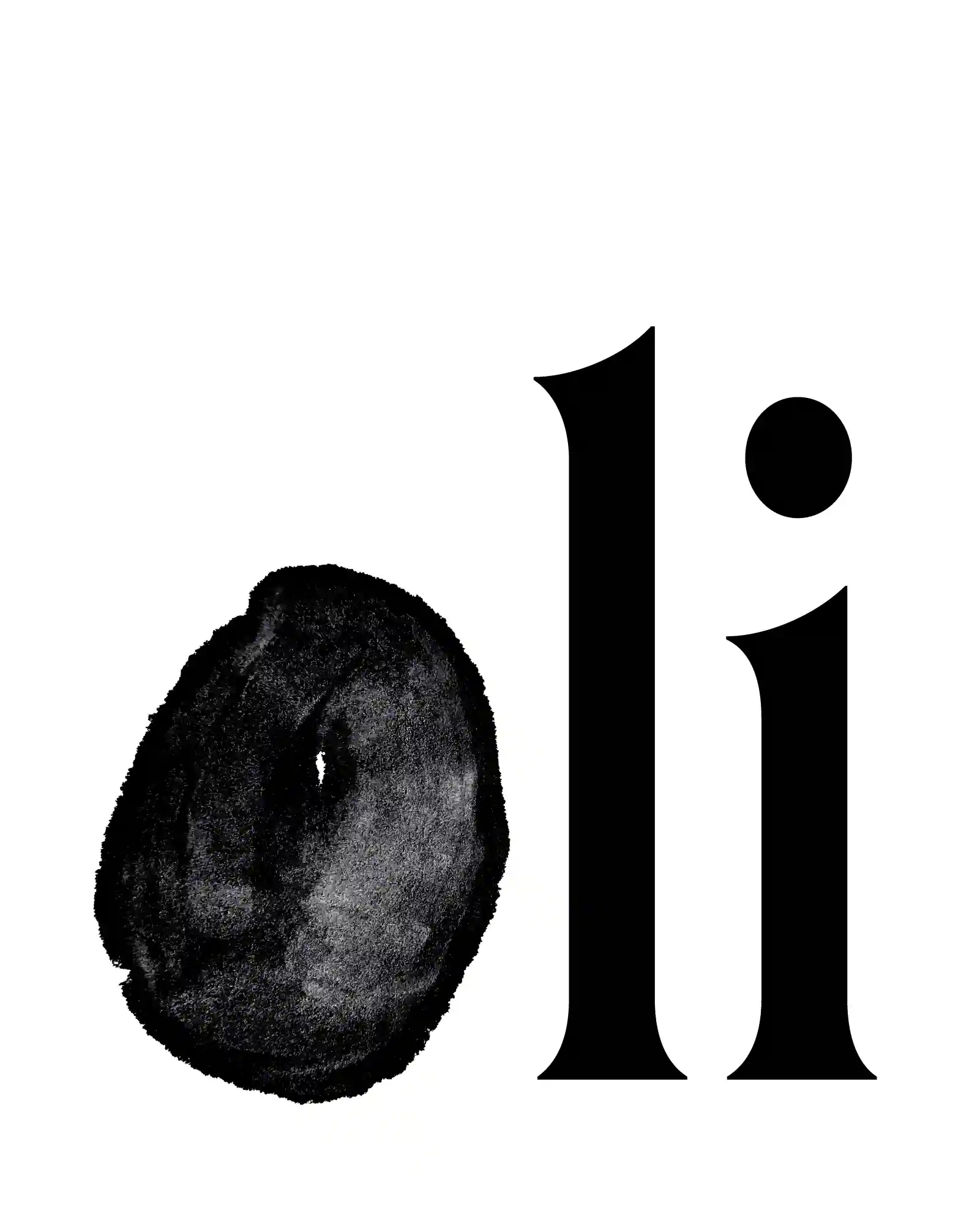
Rooted in tradition and guided by a belief in the luxury of simplicity, Oliterrani’s identity emerges from an artisanal, deeply considered approach. Every element honors origin and process — not through ornament or excess, but through restraint, intention, and quiet precision. Typography plays a central role in this expression.
Roslindale Display Condensed Regular, a refined serif typeface inspired by De Vinne’s 1892 design and reinterpreted by David Jonathan Ross and Jovana Jocic, brings historical depth and understated confidence to the brand. A subtle tilt in the letter “O” creates a visual echo of the olive itself — the product’s raw material and symbolic core.
The logotype was crafted using hand-applied nanquim ink, producing a bold yet organic mark. Its color palette draws from the natural tones of the Arbequina olive at different stages of ripeness, evoking both the texture of the oil and the untamed character of its landscape.
To further reflect the handmade nature of the product, the labels were printed using traditional linocut techniques. The resulting irregularities and textures ensure that no two labels are exactly alike — much like no two trees, no two harvests. More than an olive oil, Oliterrani is a quiet celebration of land, time, and process — where tradition, craft, and cultural restraint come together in their most essential form.