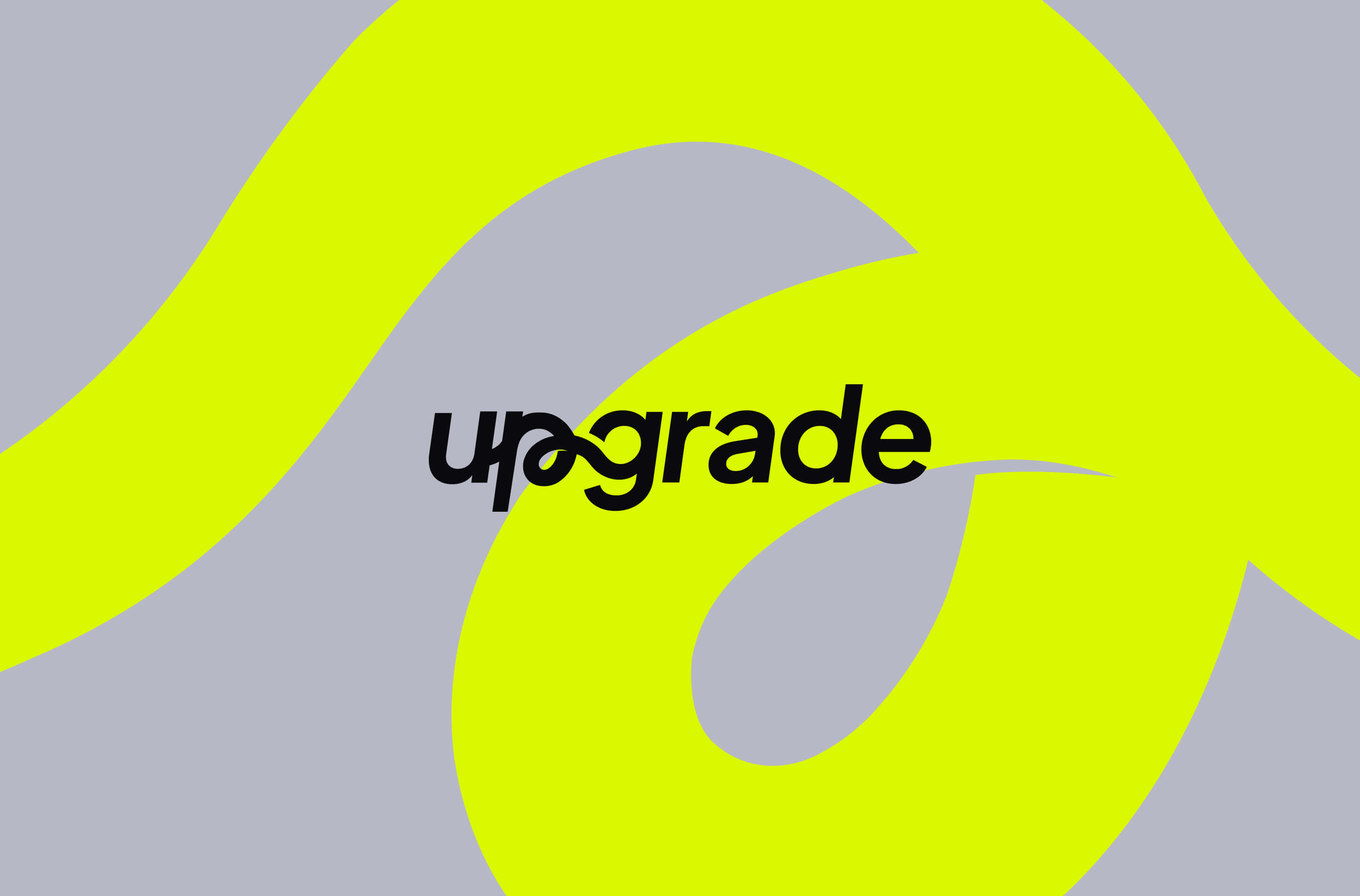
Upgrade is a high-level educational institution with a sustainable digital technology hub that prepares future professionals. faaade® helped bring the school's aspirations to life by creating a versatile and visually striking new brand identity, positioning it as a differentiated player in the market.

Brand Identity & Strategy
The brand strategy work, created through a partnership with Pixie Think, resulted in the need to translate the school's new brand personality into a more cohesive and compelling visual identity. The existing logo was considered too generic and lacking a clear conceptual foundation.
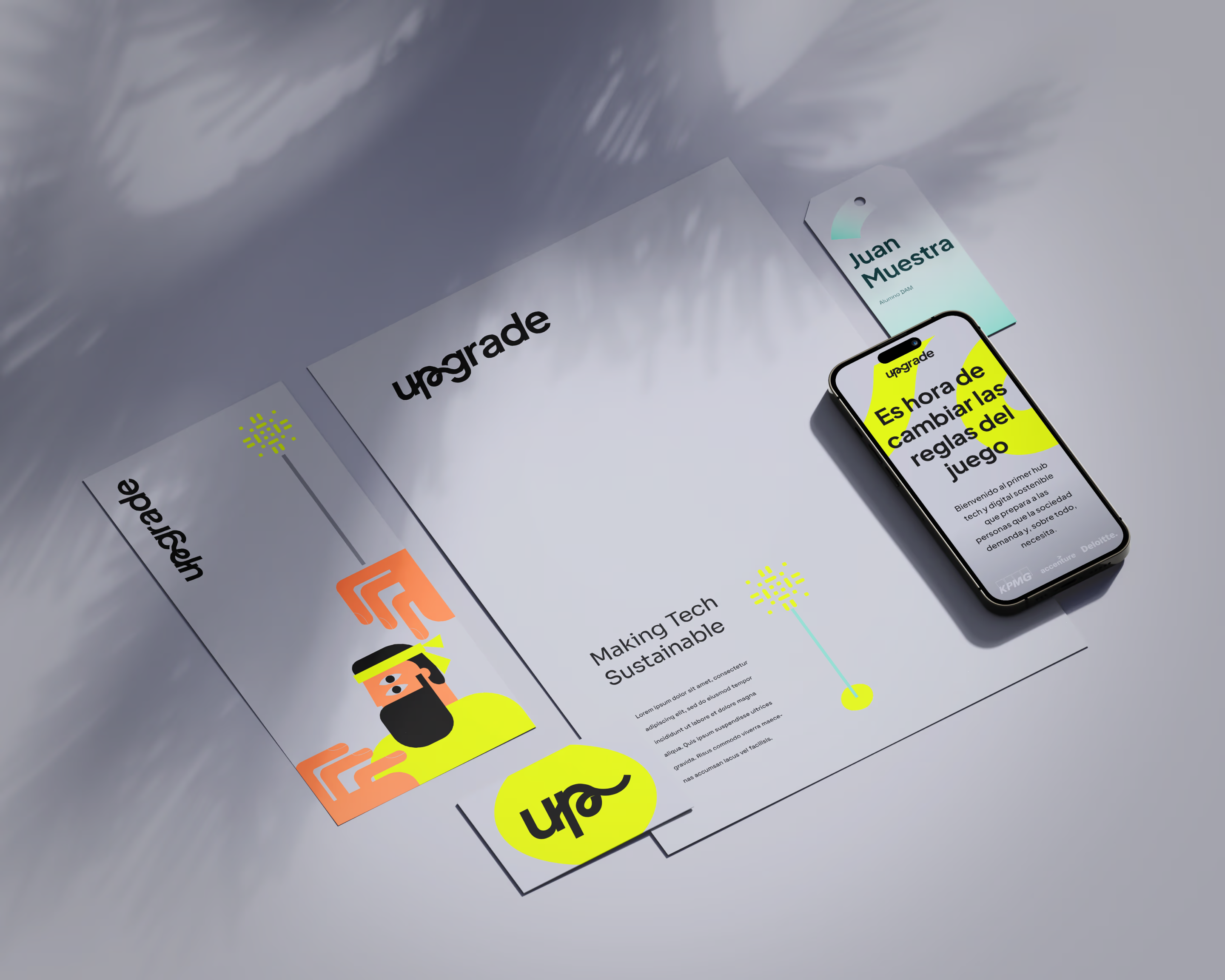
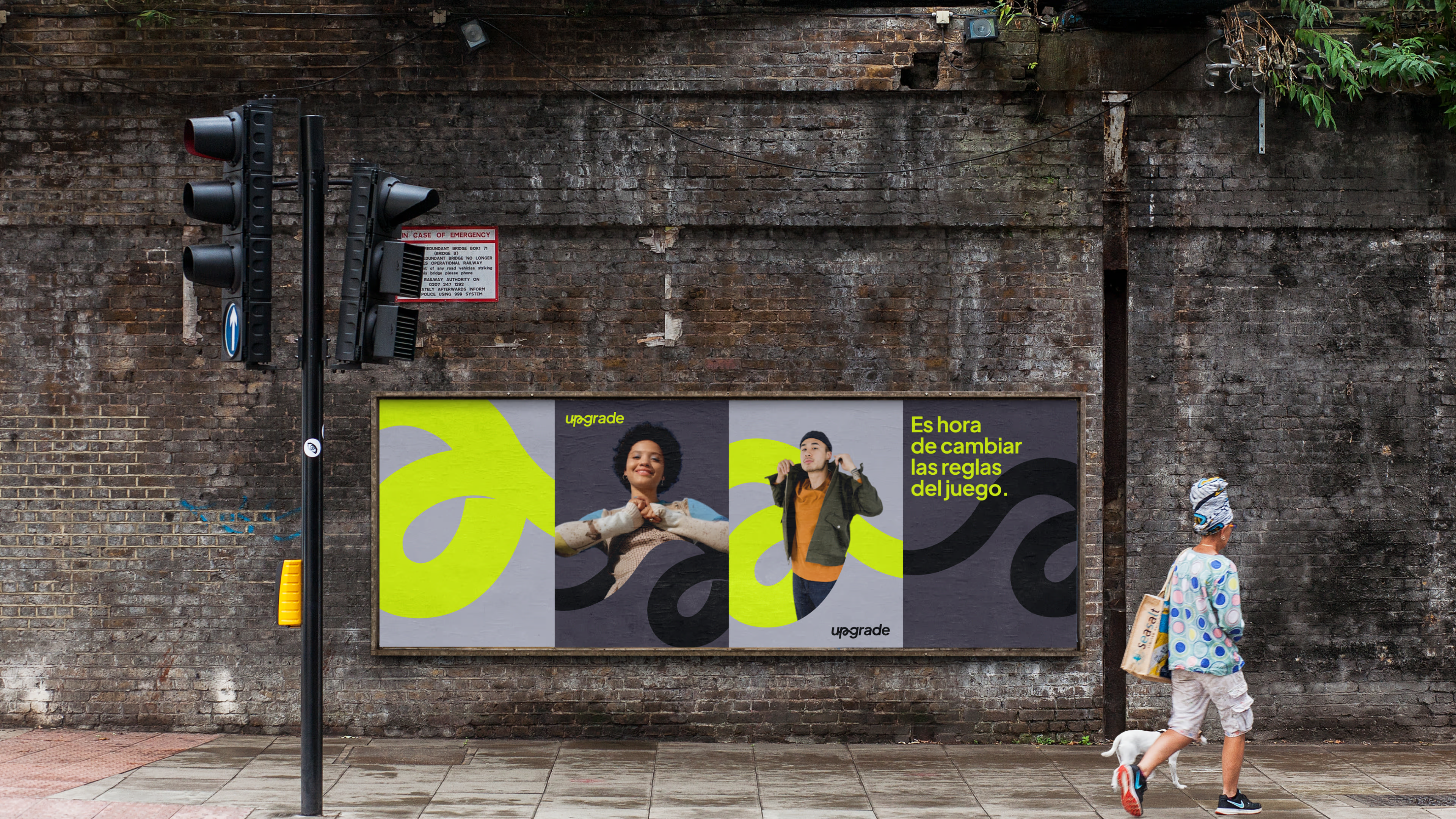
The resulting logo, color palette, typography, and supporting brand assets have empowered Upgrade to stand out in a crowded market and effectively connect with its target audience.
Additional graphic resources
tech flower digital print
swirl
blob
Isotype + “blob”
Colors
Primary
#DAF800
RGB: 218, 248, 0
CMKY: 12, 0, 100, 3
Primary
#B7B8C6
RGB: 183, 184, 198
CMKY: 8, 7, 0, 22
Primary
#0A0A0C
RGB: 10, 10, 12
CMKY: 17, 17, 0, 95
Secondary
#F3F3F3
RGB: 243, 243, 243
CMKY: 0, 0, 0, 5
Secondary
#78CFBF
RGB: 120, 207, 191
CMKY: 42, 0, 8, 19
Secondary
#083B40
RGB: 8, 59, 64
CMKY: 88, 8, 0, 75
Secondary
#FF7F50
RGB: 255, 127, 80
CMKY: 0, 50, 69, 0
Secondary
#858693
RGB: 133, 134, 147
CMKY: 10, 9, 0, 42
Secondary
#484451
RGB: 72, 68, 81
CMKY: 11, 16, 0, 68
Tertiary
#FCA311
RGB: 252, 163, 17
CMKY: 0, 35, 93, 1
Tertiary
#EC368D
RGB: 236, 54, 141
CMKY: 0, 77, 40, 7
Tertiary
#AE3458
RGB: 252, 163, 17
CMKY: 0, 35, 93, 1
Tertiary
#0077B6
RGB: 0, 119, 182
CMKY: 100, 35, 0, 29
Tertiary
#440381
RGB: 68, 3, 129
CMKY: 47, 98, 0, 49
Tertiary
#6F58C9
RGB: 111, 88, 201
CMKY: 45, 56, 0, 21
Typography
Primary
PLUS JAKARTA SANS
Aa
ABCDEFGHIJLMNOPQRSTUVWXYZ
abcdefghijklmnopqrstuwxyz
0123456789 &%@?#*;
Secondary
SPACE GROTESK
Aa
ABCDEFGHIJLMNOPQRSTUVWXYZ
abcdefghijklmnopqrstuwxyz
0123456789 &%@?#*;
Grid
To ensure a consistent visual identity across all brand touchpoints, we have developed a flexible grid system. This grid provides a structured framework for positioning the logo and tagline in a variety of formats, while preserving the brand's distinctive look and feel.
Grid
To ensure a consistent visual identity across all brand touchpoints, we have developed a flexible grid system. This grid provides a structured framework for positioning the logo and tagline in a variety of formats, while preserving the brand's distinctive look and feel.
Illustrations
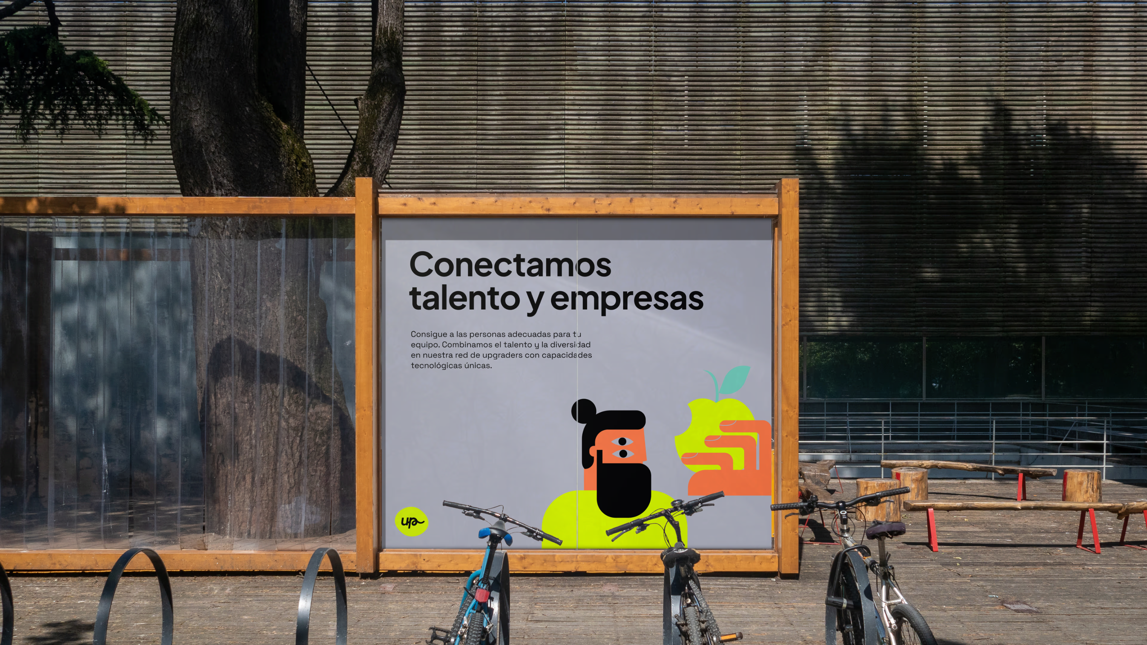
As a complementary resource, we define an abstract illustration style related to your values and positioning. With it, we introduce a new identifying asset that can be used as secondary support in Upgrade's communication, merchandising, and social media pieces.
Web
Selected Works

Sagardoy SchoolBranding

ADCE*Festival'23Identity
Matte Black® Display TypefaceTypography
Bureaucracy® TypefaceTypography
MAR® - A Typographic Poster SeriesTypography